The visual design of Demon Slayer's combats
Ufotable is killing it, with simple but sharp tools.
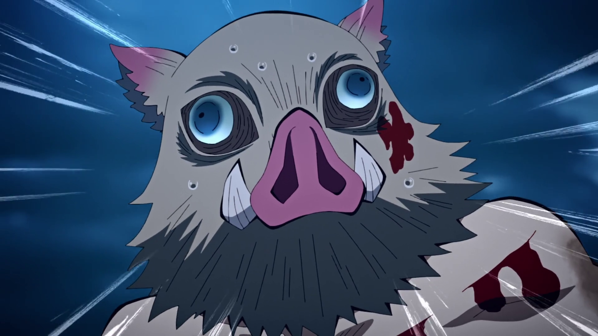
An anime article? What is this?
Here is a short article adapted from a twitter 🧵 thread 🧵 I wrote about the visual design of Demon Slayer, a very popular anime that I love.
Disclaimer: I'm not a professional artist or animator, the objective here is to analyze a scene from the show to extract design rules that could be applied in another context ... such as videogames!
Behind the scene: Ufotable
Ufotable is now a very very popular animation studio. Probably even one of the most popular in the world, alongside Pixar or Ghibli, and all thanks to the enormous success of Demon Slayer. The manga tells a classic and formulaic story, but is bursting with fascinating ideas fueling epic combats and one of the best sibling relationship I've seen in fiction. It's funny, violent, epic, touching and all of that in the span of a few pages, juggling with wildely different tones effortlessly.
And the anime adaptation does all of that and more. It expands dramatically on all action scenes with the visual flare that Ufotable is known for. Based on a smart mix of 2D and 3D elements, well blended thanks to an immense compositing effort, forging a unique animation style.
Breakdown of a Heaven's Feel shot, the prior work of Ufotable before Demon Slayer
If you are more curious about Ufotable and how they work, I'd recommend this interview of Yuichi Terao, compositing director at Ufotable.
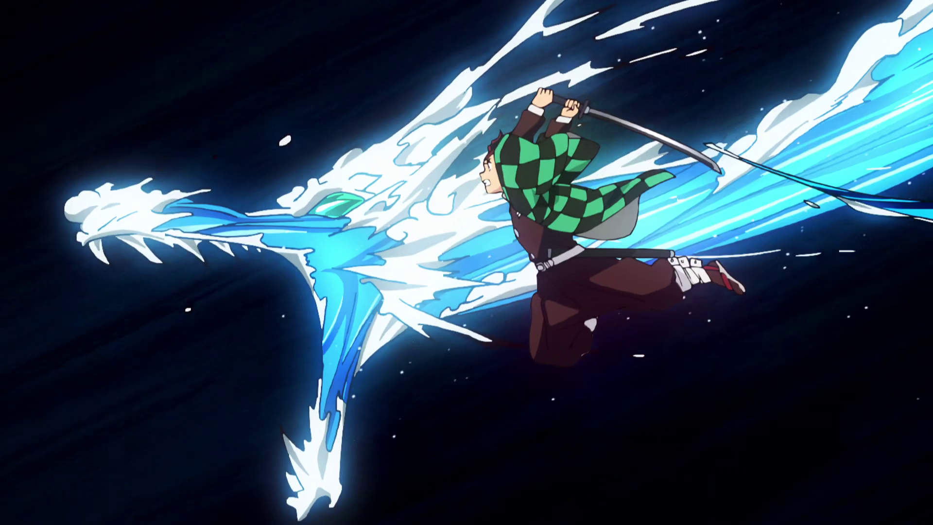
This 2D/3D DNA is of course found in Demon Slayer with smooth camera movements framing 2D characters in 3D environments or the different breathing techniques which are built from 2D animation painted on top of 3D renders.
Often very appealing but sometimes you end up with badly shaded flesh tentacles that don't seem like they belong in the frame.
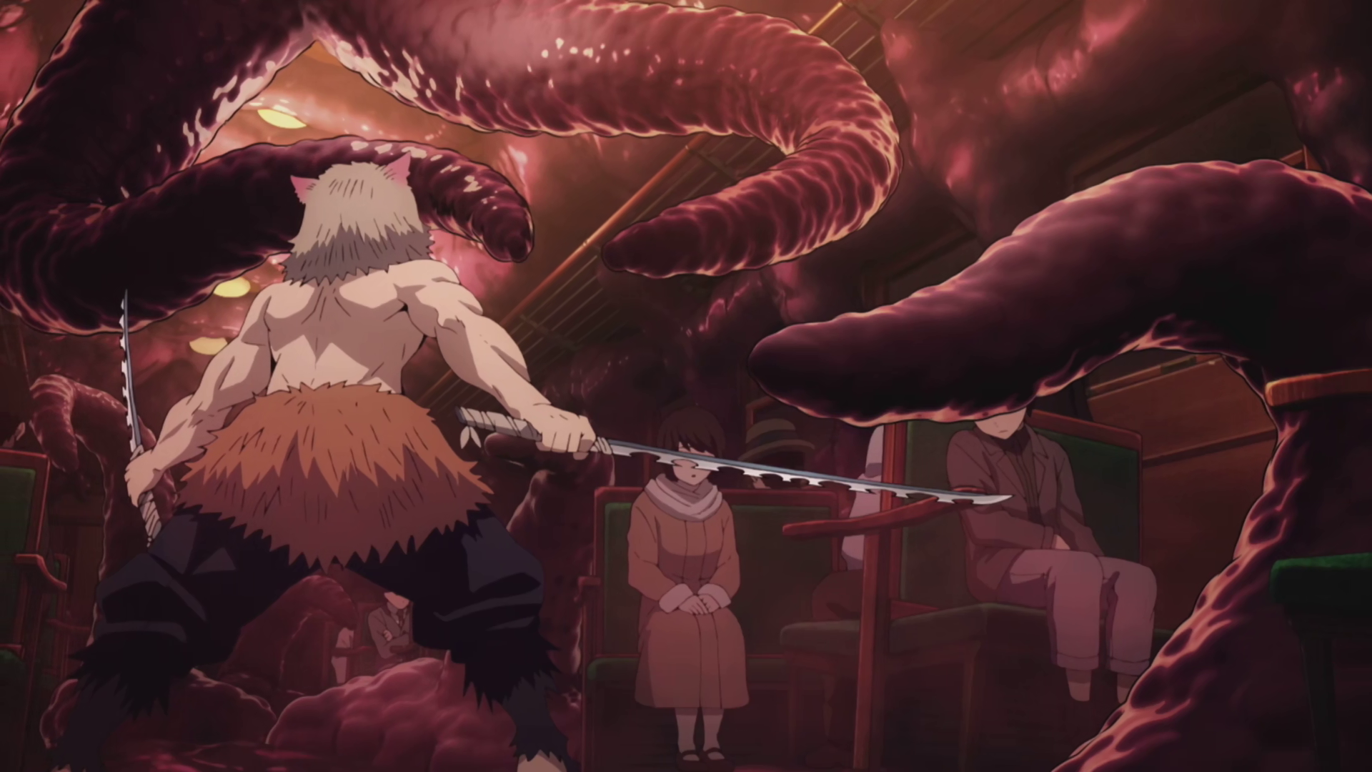
Not their best work...
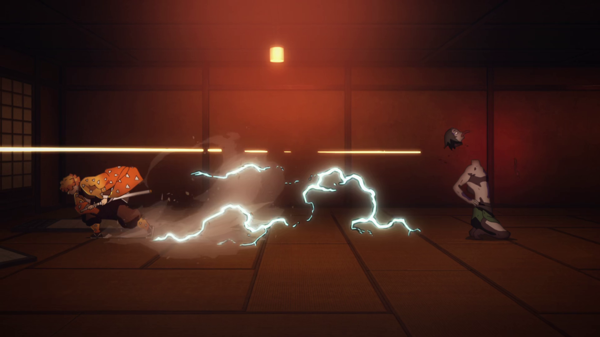
A lot of animators are contributing to the success of Ufotable, but the most famous one has to be Nozomu Abe, responsible of most of the "money" shots of the first 2 seasons of the show.
The scene
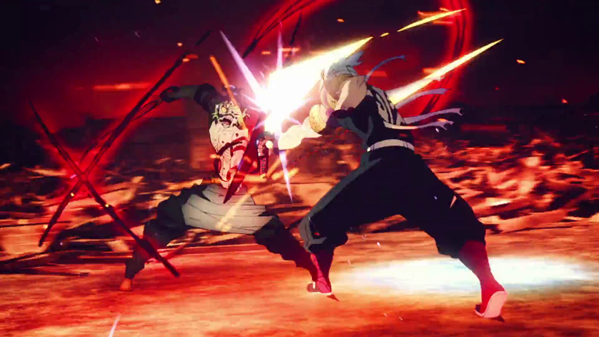
But enough with the introduction! Let's take a shot and analyze it :
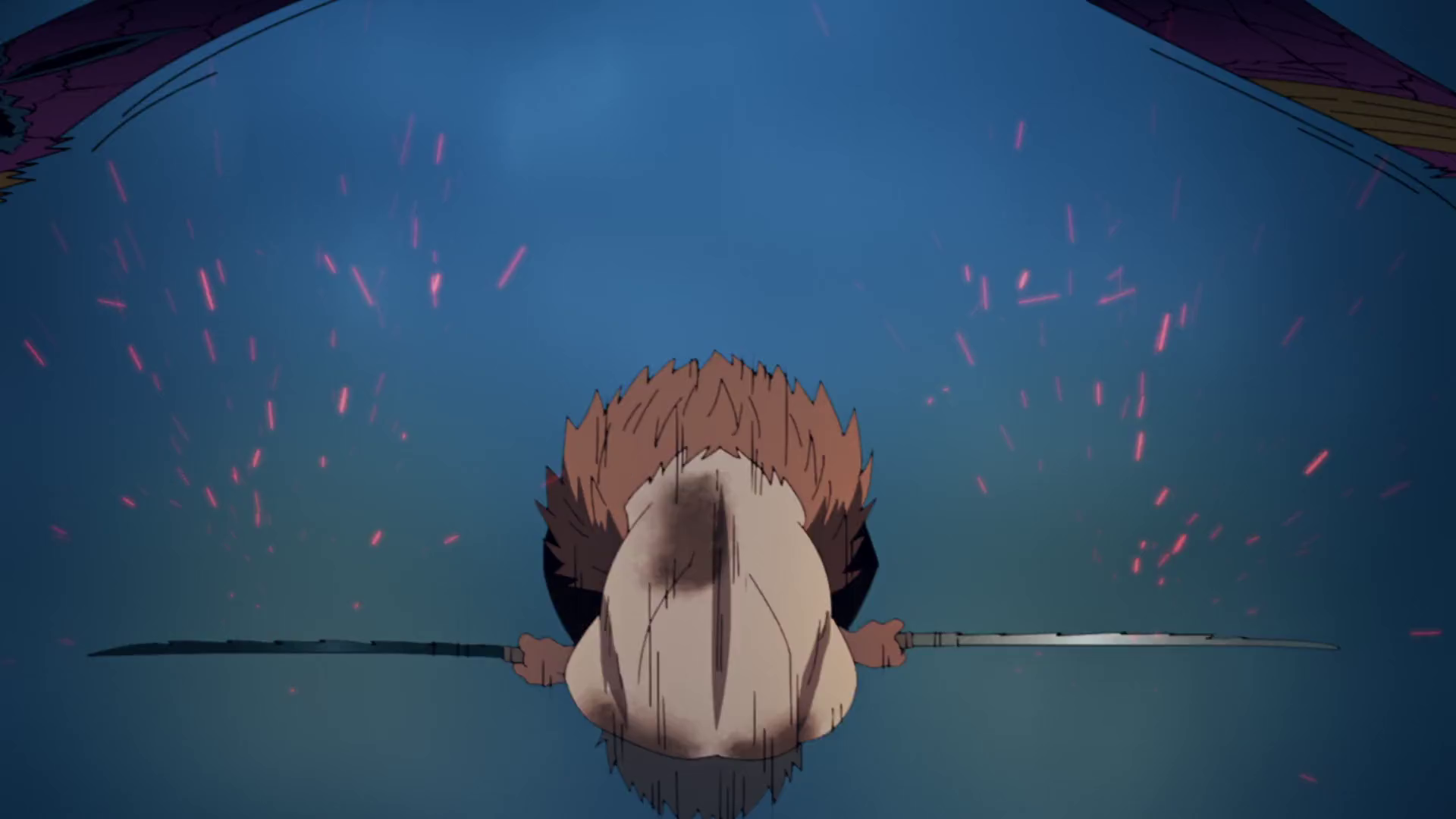
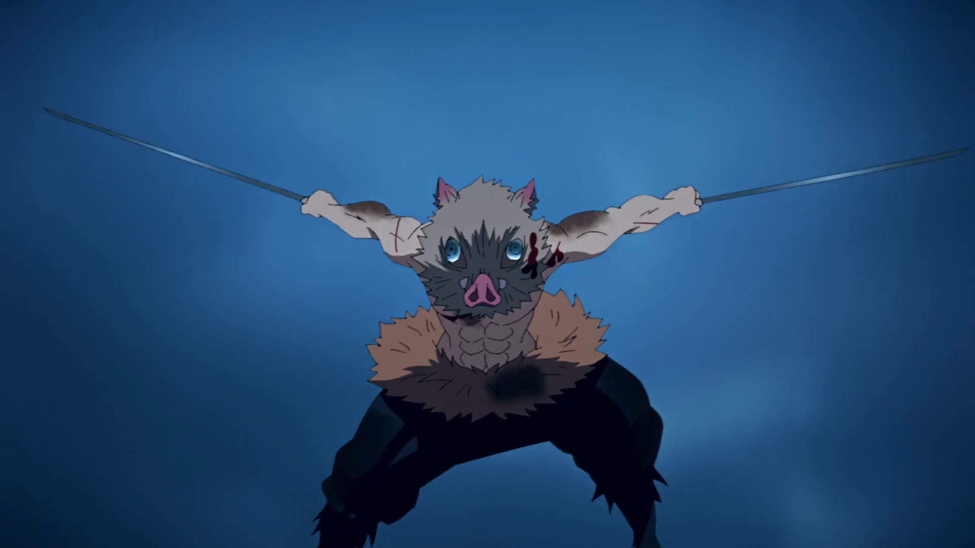
A shot from season 2 episode 9
Why this shot?
- Pretty simple framing so better to see the VFX and compositing techniques I want to talk about
- Still very action-packed, with 5 attacks in 8 seconds!
- It's a very personal thought, but I really like Inosuke's animation in the show
Animation
Let's begin by looking at the animation frames to understand the base material. Most of the action is animated at 12 frames per seconds, one drawing per 2 frames, or "on twos".
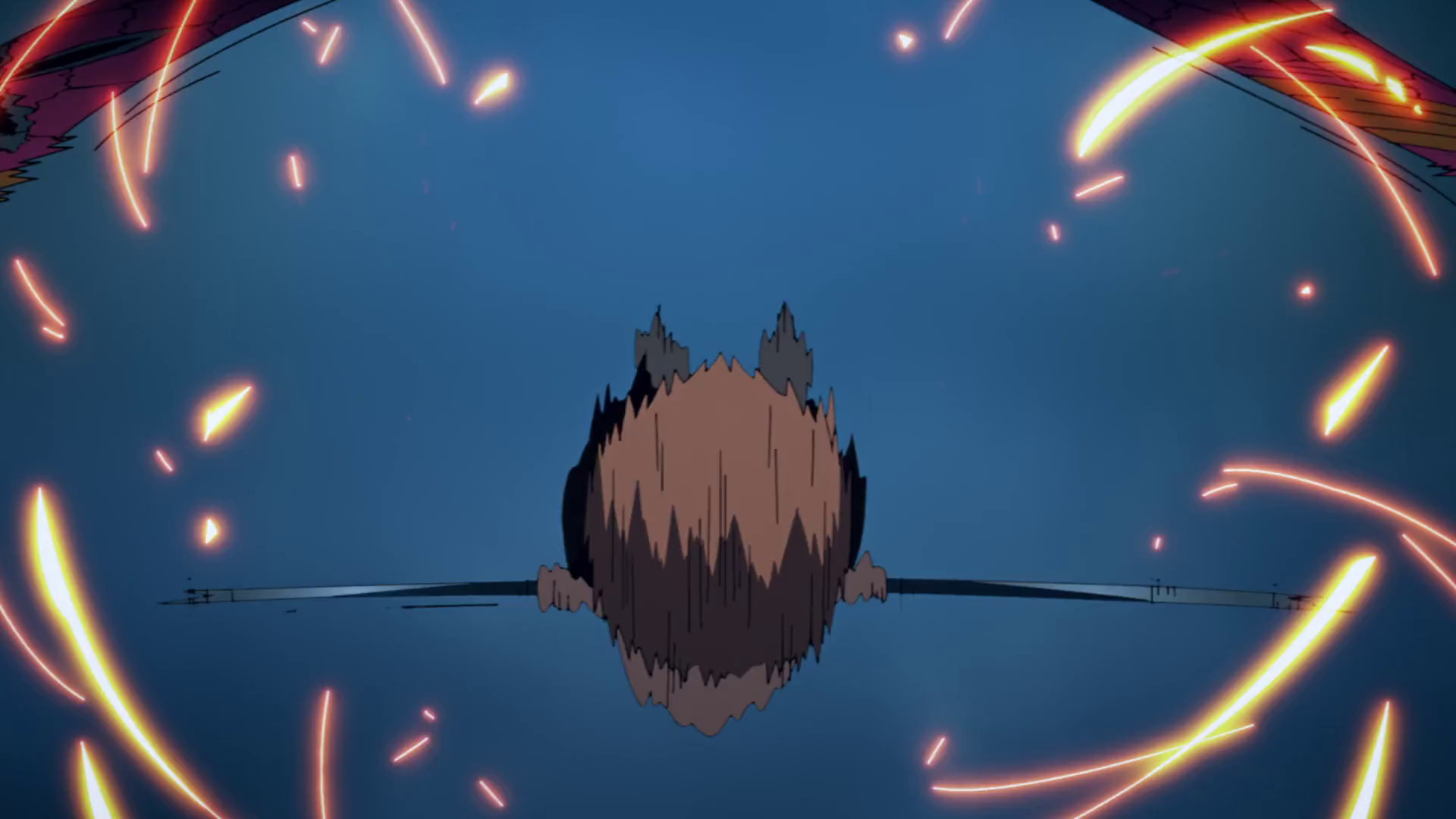
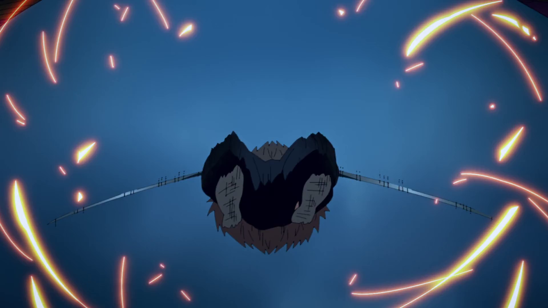
But there are exceptions, the shot can dynamically change if the action needs it like this body rotation: 4 drawings in 4 frames, with motion blur directly drawn in. Other slowmo effects are also animated "on ones" to create a better smoothing feeling.
The action follows a simple but effective rythm:
- Prepare (long)
- Strike (short)
- Relax (long)
The strike itself is often made in just one frame, with a brutal change of pose:
But the preparation and effect of the strike are felt for a long long time on the character pose. Here is a video to visualize what I mean (each point is a different drawing, red dots mark important pose changes) :
Animation breakdown
Demon Slayer's fight choregraphies are forged in this rythm, sometimes adding slowmo to artificially create breathing moments in very hectic scenes.
Center framed
Now that we know what we work with, we can look at the first principle: center framed.
Framing breakdown
Action is compressed at the center of the frame so that the eye doesn't have to move too much, in order to follow what is happening without getting tired despite the intensity. This is something planned at the storyboard stage obviously.
It's a classic principle in the action movies, easing a lot the editing work in post-production. One of the best examples you can found is Mad Max: Fury Road:
DP John Seale about Mad Max Fury Road
Camera Shake
Second technique still on the camera side: shake. This camera shake is animated at 24fps, helping to fluidify the overall 12 fps animation. Here is a visualization of the camera shake added on top of the basic animation:
Camera Shake breakdown
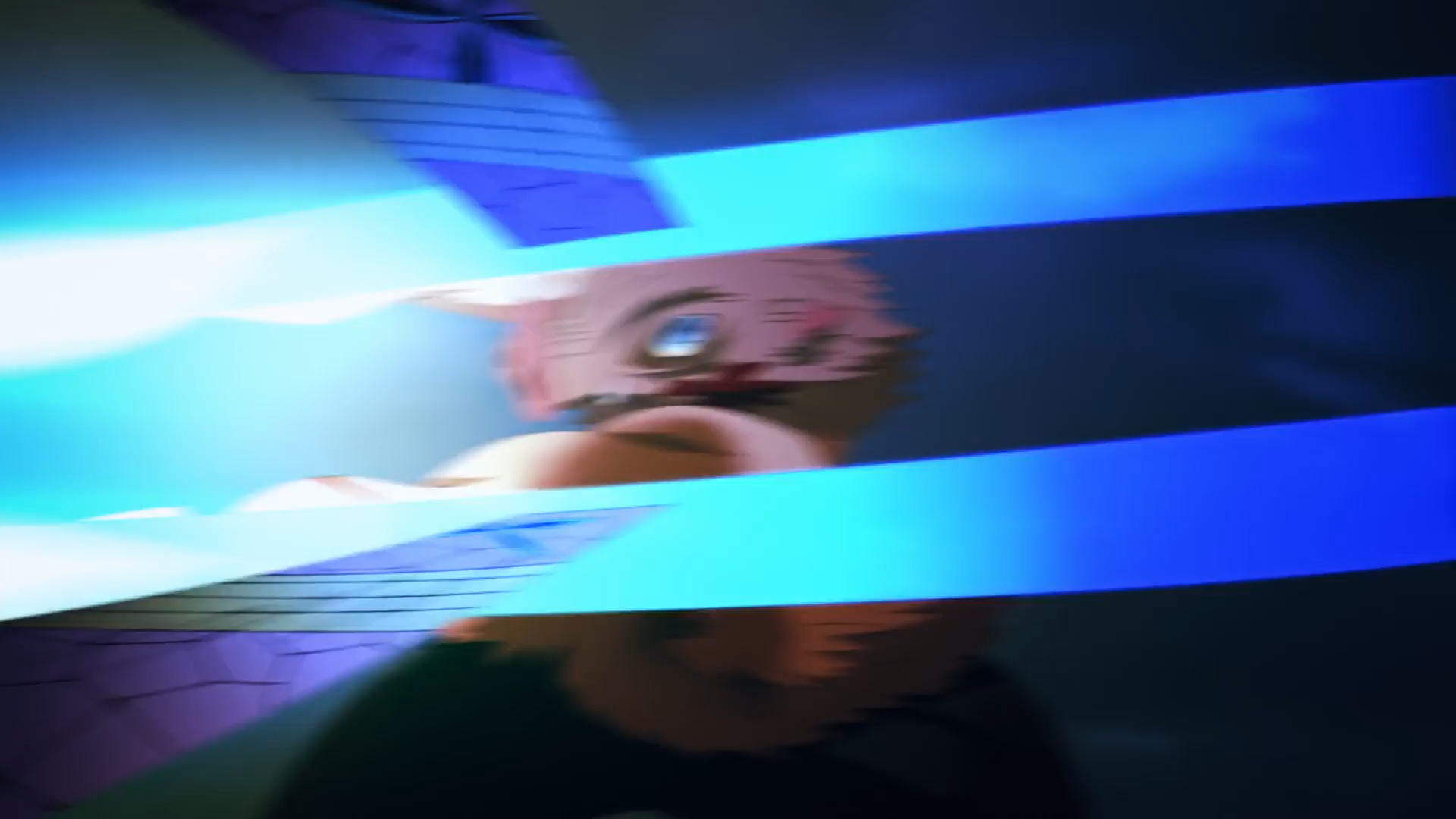
On top of it, on each impact, the camera is bumped in the direction of the strike. This shake add articifial motion blur which makes the impact frames even more chaotic (in a good way)!
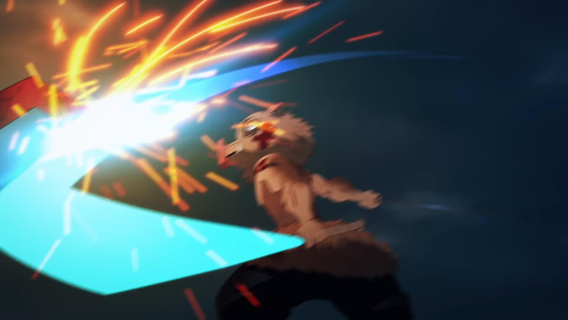
A blurry strike (it gets less blurry afterwards)
And here is the shot without any camera shake, immediately very different (stabilized by hand, forgive the small issues):
Shot without camera shake
Light
To see the third technique, we better switch the shot to black and white:
Shot B&W
With that, you should see how it flashes in intensity.
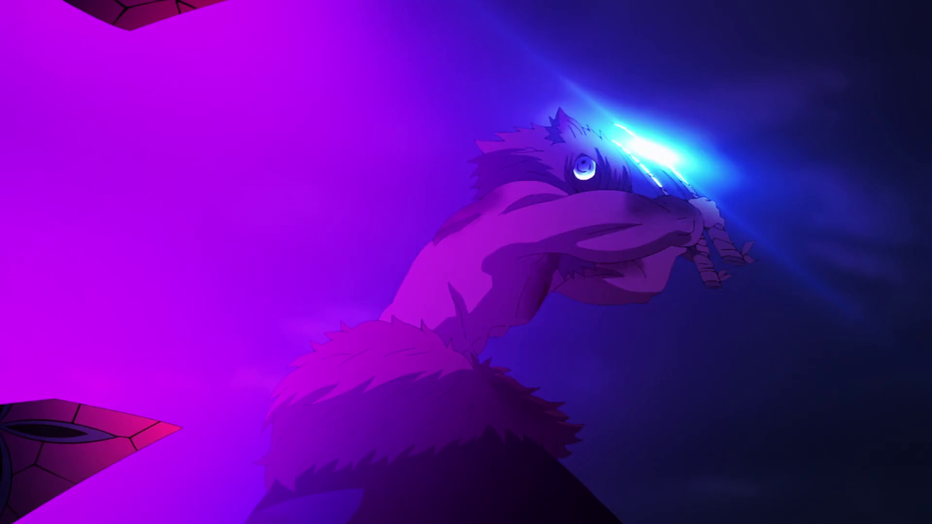
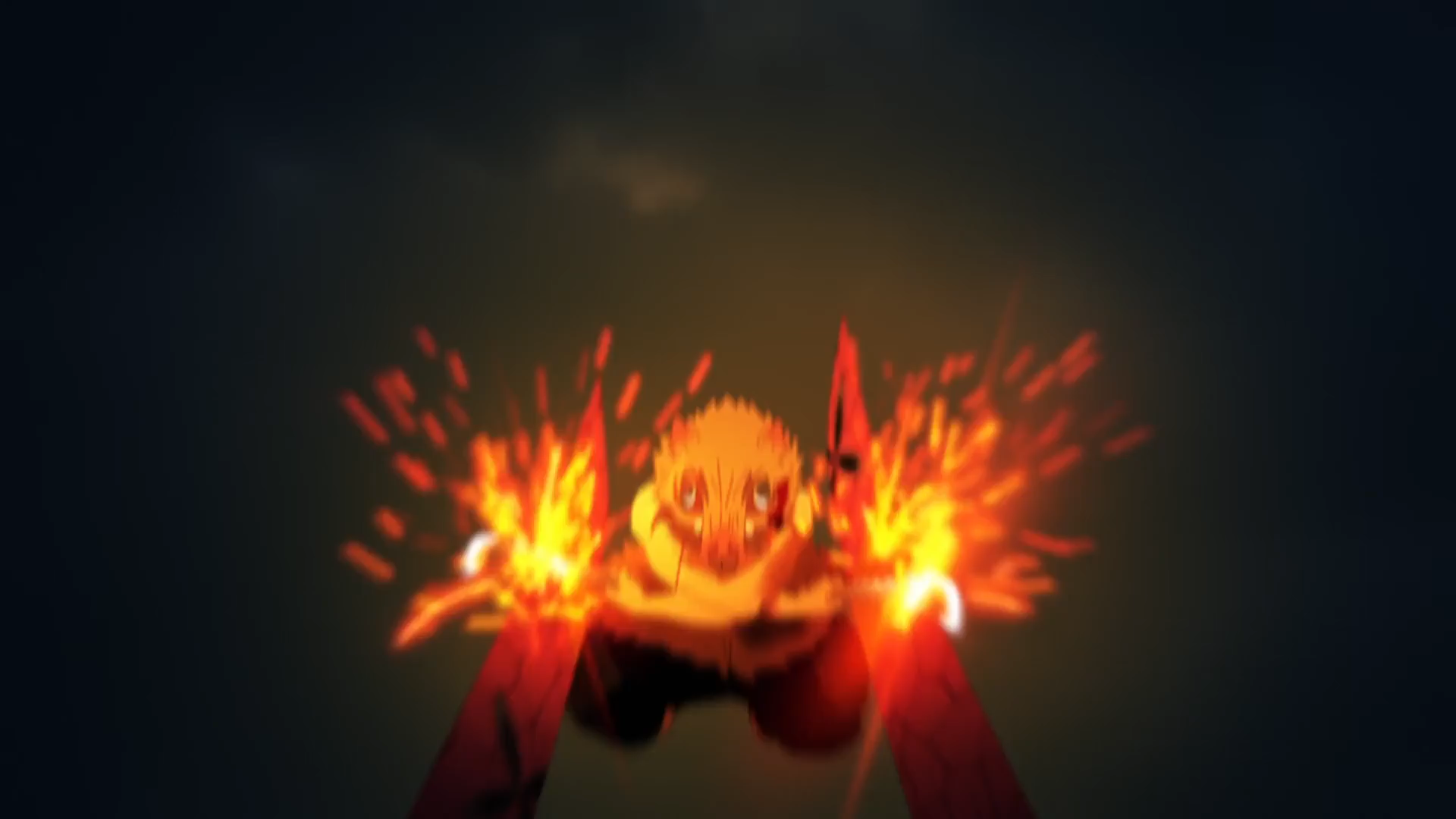
Each sword strike is announced by a glint on the sword, then reinforced by a light shape and sparks. Conversely, each fabric strike is announced by a softer, blurrier light invading the screen.
Beyond the form that the light takes, the light color is also important: blue for the sword, purple for the enemy, gold for the sparks. All of this combined gives us very clear signals about who is doing what and when.
Light breakdown
Impact Frames
The last light principle is quite widespread but Ufotable excels at it: impact frames. The idea is to insert a particularly contrasted frame at the moment of impact to give it an additional visual impact:
Here the impact frames are rather timid, creating contrast by darkening areas, but if we go back to Nozomu Abe, he applies this technique absolutely all the time in his shots by creating contrast thanks to the silhouettes of the characters:
Impact frames in Nozomu Abe shots
Conclusion
There would still be a lot to say but I'm really not an expert so I'll stop there! The sound also plays a key role and I find the sound design of Ufotable quite fantastic on this series.
The purpose of all this visual and sound grammar, simple but perfectly applied, is to base the viewing experience on the feeling of things rather than on their perfect understanding.
These techniques are not magic, they only accentuate the initial animation, they do not replace anything. They interest me as a science communicator and game designer for their “unconsciously didactic” side.
Shot full breakdown
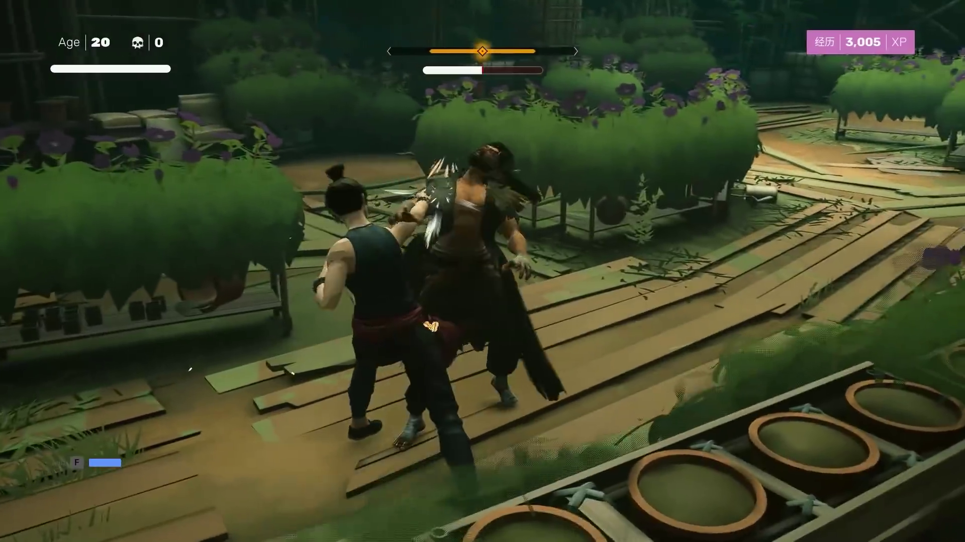
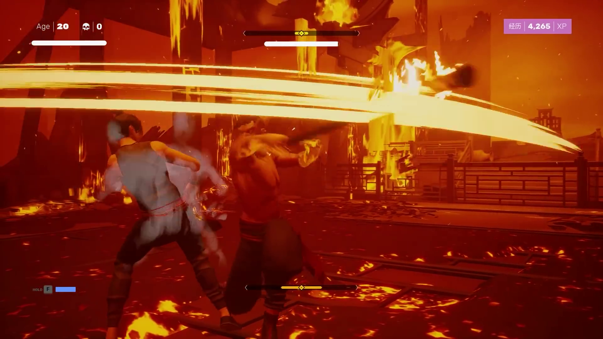
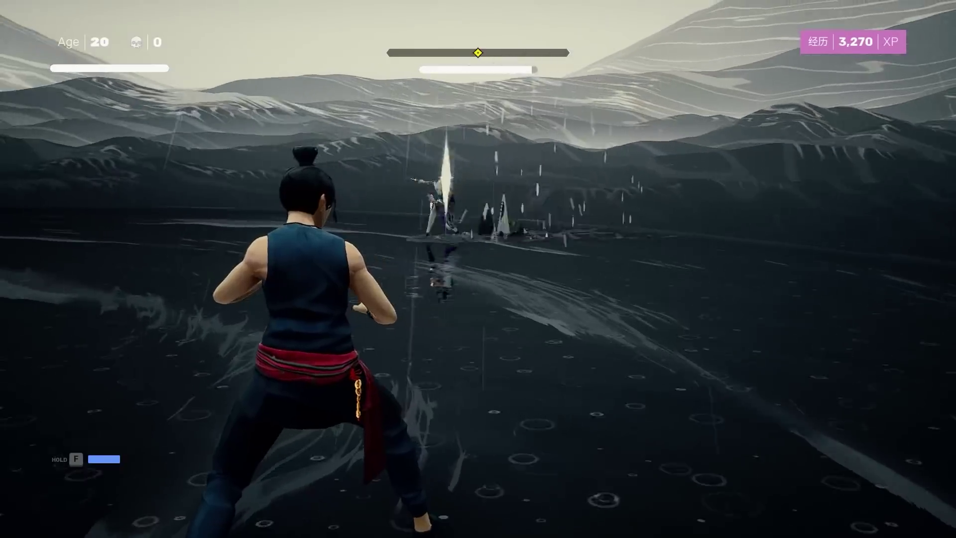
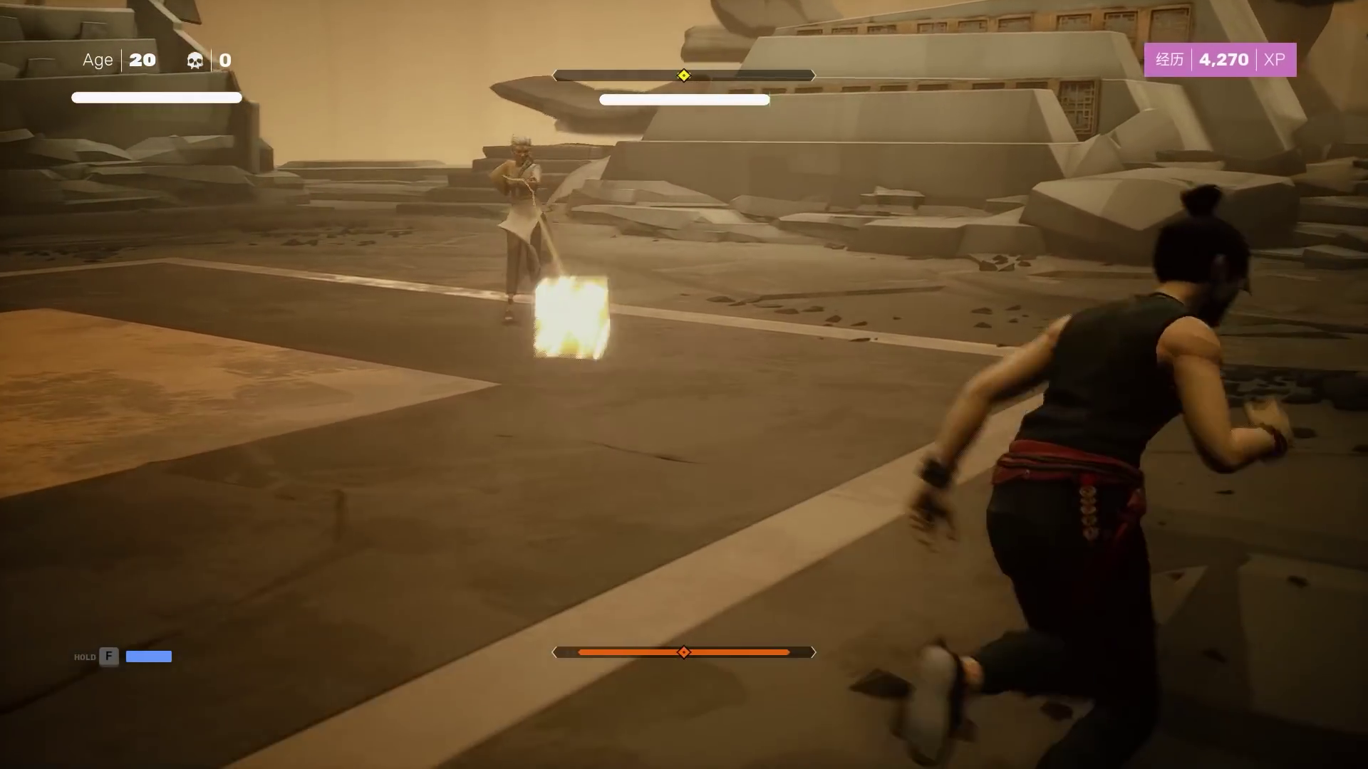
For example, the game Sifu shares some of this DNA on its visual feedbacks:
The realization of Ufotable on Demon Slayer is not exempt from any reproach but remains very impressive for a series... and considering how the manga evolves, we are going to be entitled to beautiful things in animation until the end!
Let them cook :)
